ECLIPSED

SELECTED WORK, IN THE HAND

On a phone.

Most of the web is designed on a 27 inch display and met on a 6 inch one. We build at phone width first, so this is not a compromise view. It is the view.

scroll

HD Digital Solutions

GROWTH AGENCY · SITE, MOTION, 3D

A pink-to-black scroll with 3D props that had to stay readable on a phone, so the type scale and the prop sizes are driven off the viewport rather than fixed.

shop.eclipsed.site/18 ↗
HD Digital Solutions at phone width.

Scroll inside

Araw / Climate

COMMUNITY PROJECT · BRAND SITE, EDITORIAL

An editorial site people actually read on the bus. Long measure on desktop, short measure here, and the illustrated sun redraws rather than scaling down.

eclipsed.site/araw ↗
Araw at phone width.

Scroll inside

ELBINARY / Icebreaker

INTERACTIVE APP · PRODUCT BUILD

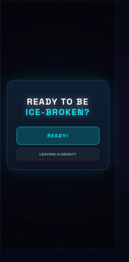
An app, not a page. Everything is thumb reachable, the targets are large, and the whole thing works in one hand without a single pinch.

exp.eclipsed.site/ELBINARY ↗
ELBINARY at phone width.

Scroll inside